Most organisations and companies use organisational charts to represent their organisational structure as accurately as possible. The organisational chart is a practical and effective way to represent the distribution of responsibilities to simplify the structure of the company.
What’s an organisational chart?
An organisational chart is a schematic representation of the hierarchical, organisational, and functional links within your structure. It is a snapshot of the functions occupied in your organisation and the relationships between them at a given moment.
The organisational chart provides information about:
- The actors in the organisation: for each department, the organisational chart indicates the function performed and the name of the department head;
- The relationships between the actors: the organisational chart emphasises the hierarchical, functional, or cooperative links between different departments.
What is it used for?
The organisational chart is used to visualise your organisation. It is primarily a communication tool designed to facilitate understanding of the relationships and links within your structure.
It mainly fulfils the following objectives:
- Allowing a newcomer or an external person to understand the organisational functioning of your company;
- Allowing employees to better know their contacts, their roles in the company, the links between different jobs, and their possible hierarchical attachments. This is a good way for your employees to know their exact place in the company, without ambiguity regarding hierarchical positions;
- Allowing an external person, such as a client or partner, to directly address the right contacts thanks to an easier understanding of your structure.
What are the advantages and disadvantages of organisational charts?
Using organisational charts has the advantage of providing a visual formalisation of your structure and thus constituting a reference framework for your company.
However, an organisational chart remains a diagram, and as such, it has the major disadvantage of being static while the company is a moving structure. It is therefore not sufficient to describe the reality of your organisation. It should be considered as a reference element (with date mention) but not as “the” reference.
How to create an organisational chart?
Creating an organisational chart involves several steps:
- Conduct an inventory of the functions, employees, or departments of the structure to be represented.
- Identify the hierarchical and/or functional relationships between the functions, employees, or departments
- Graphically represent the organisational chart, according to the desired level of detail.
There are several ways to represent an organisational chart depending on the desired level of detail and the company culture (hierarchical organisational chart, cloverleaf, star, circular, etc.). For example, a company with a very strong hierarchical structure may choose to use a hierarchical organisational chart (also called a “pyramid organisational chart,” “rake organisational chart,” or “banner organisational chart”).
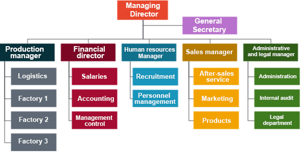
“Folded” hierarchical organisational chart
The hierarchical organisational chart itself has several variants, such as the “folded” type organisational chart, which is frequently encountered:

Different types of organisational charts

There are different formats of organisational charts, the choice of which depends on the desired level of detail, the complexity of the organisational structure, or the company culture.
Here are some of the most common ones.
Hierarchical organisational chart
This type of organisational chart is the most common. It is often pyramidal, with a group or person at the top, while those with fewer responsibilities are below. In this type of structure, members generally communicate with their hierarchical superiors and subordinates.
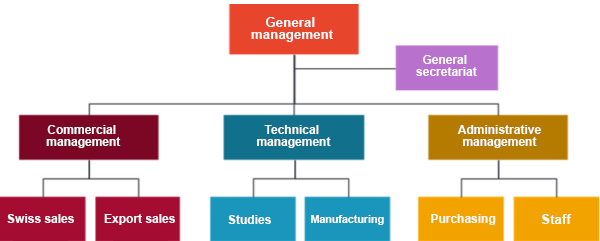
“Classique” hierarchical organisational chart
Note that this type of organisational chart is also called a “rake,” “banner,” or “pyramid” organisational chart, and when the graphical elements contain the names of people and their functions, it is called a “functional” organisational chart.
These organisational charts have the advantage of simplicity and clarity: each employee, as a member of a team, knows “on paper” who they should report to. However, they may reflect weaknesses in the organisation, such as a lack of coordination and information flow between branches of the structure, or the weight of the hierarchy on staff, whose initiative may be hindered.
Several variants of this organisational chart exist: they retain the principle of aligning different command units. Thus, we find the “tree” organisational chart (agents at the same hierarchical level are on a vertical line), or the “folded” organisational chart, which combines the “pyramid” presentation with the “tree” presentation:
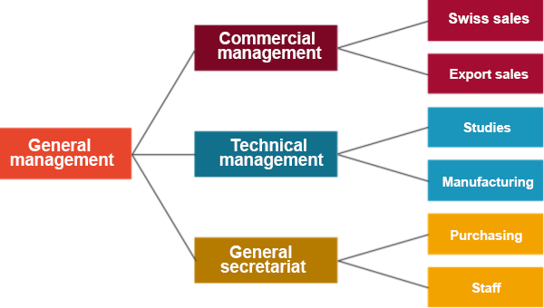
“Tree” hierarchical organisational chart

“Folded” hierarchical organisational chart
Cloverleaf organisational chart
A company sometimes functions in a more collegial manner and wishes to put its different functions on an equal footing. It is then possible to use a “cloverleaf” organisational chart, the most common breakdown of which is into the following 4 functions: operations, management, financing, and forecasting.
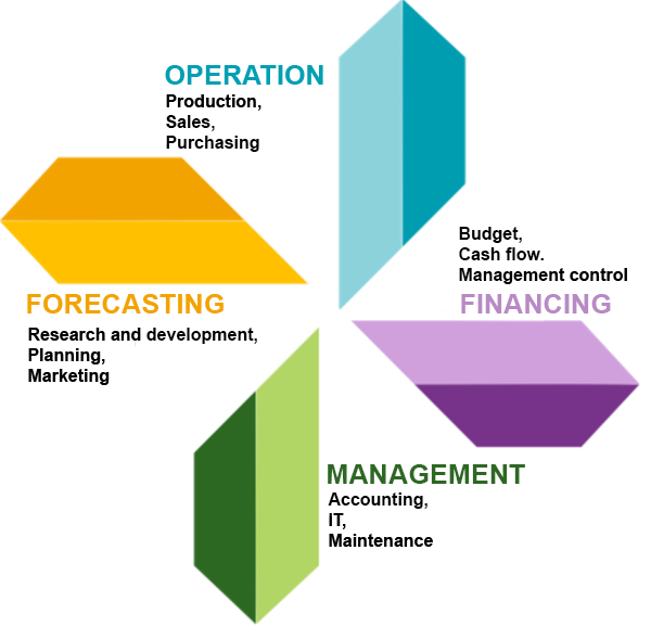
“Cloverleaf” hierarchical organisational chart
Circular organisational chart
There are other possible representations for companies that wish to emphasise non-hierarchical command.
For example, consider “Harley Davidson.” The company chose to represent its structure with three circles: “create demand,” “produce the product,” and “provide support.” Each circle of the company had one or more leaders, who could move from one circle to another depending on needs and context. Former members of the company’s management took on the role of sponsors and were responsible for energising these circles.
An analogy can be made with school classes: at the end of each lesson, students leave the classroom to go to another and change subjects. For the circles, the idea is similar: with each mission, it is possible to change circles to perform another function.
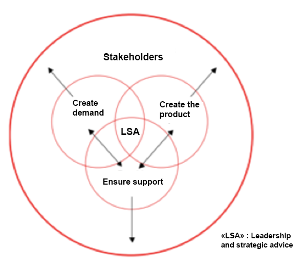
“Circular” organisational chart as practised at Harley Davidson

Representing your structure

Planetary organisational chart
In this model, each unit of the organisation is represented with its services and general management. The diagram is then completed between the different units through links. The emphasis here is on decentralisation and delegation of authority.
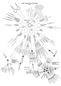
“Planetary” organisational chart: League of Nations, 1930
Standardised organisational chart
Standardised organisational charts are those that comply with a standard. Using a common standard has the advantage of allowing comparisons within a company and with other companies. However, their creation is constraining, and their reading is sometimes difficult, which explains why few companies use them.
For example, the NF Z 12 001 standard developed by AFNOR (French Standardisation Agency) proposes a set of specific rules to be followed in an organisational chart. The organisational chart is presented from top to bottom; each line is attributed to a single member or service. Thus, each line can only include one person.
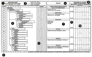
The different zones of the standardised organisational chart above are as follows:
1. Title;
2.Codes;
3.Legends of information and cooperation links;
4.Hierarchical structure (each number corresponds to a hierarchical level);
5.Links (highlighting the type of link existing between two positions);
6.References (additional information by department);
7.Information concerning the function and duties of the position holder;
8.References (company, department, date, sheet number);
9.Budget references (when specific budgets exist, their code must be entered);
10.Cumulative staff (to highlight overall staff and their distribution between different sectors).
Our added value
Organisational charts, regardless of the chosen representation, are useful tools for visualising the structuring of a company at a given moment in terms of actors present and command relationships that exist between them, and for communicating this.
However, they provide little information regarding the distribution of tasks and responsibilities; we therefore believe that this should be accompanied by complementary tools such as job descriptions or RACI matrices.
Furthermore, organisational charts can quickly become obsolete, especially in companies experiencing significant staff turnover. They can therefore quickly lose relevance if not regularly updated.
Finally, they only represent the “official” relationships between the different units of the organisation: they do not contain the informal or social links that allow a company to operate or transform.
And, although they show the authority links within an organisation, they do not reveal how this authority is exercised, the management style, or the flaws in this organisation.
In conclusion, while the organisational chart has the merit of simplifying the way you visualise your structure, it does not, as the sole means, improve its functioning and efficiency to gain performance.

How to simply visualise your company structure?

4 important points about organisational charts
- Definition and functionalities
The organisational chart is a visual representation tool for organisational structures, illustrating hierarchical and functional links. It is useful for internal and external communication, helping to understand the functioning of the company, roles, and relationships between different actors. - Advantages and disadvantages
Organisational charts offer structural clarity and serve as a reference framework. However, their static nature may not accurately reflect the constantly evolving dynamics within a company. They are considered reference elements rather than absolute representations. - Creating organisational charts
Creating an organisational chart involves inventorying functions and departments, identifying hierarchical and functional relationships, and representing them graphically. The choice of organisational chart type depends on the company culture and the required level of detail. - Types of organisational charts
The article details several formats of organisational charts, including hierarchical, cloverleaf, circular, planetary, and standardised organisational charts. Each type has its specificities and is adapted to different organisational structures and needs.
Contact us
Write to usFollow us on LinkedIn
Follow usAller plus loin
Different types of organisational charts: definition and uses
Organisational chart: a visual tool for structuring and understanding an organisation...
Organisational structure: definition, advantages, and disadvantages of different business structures
Organisational structure: key to performance and adaptability. ...

